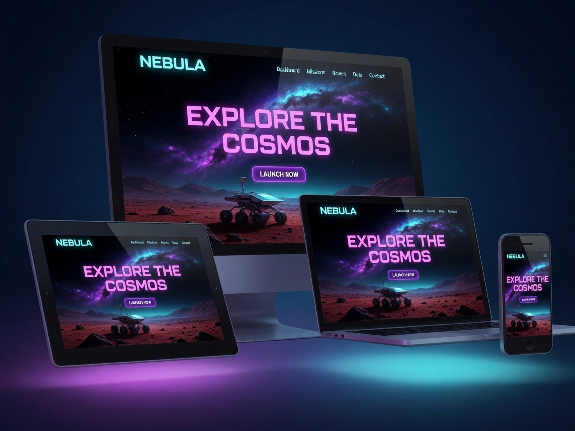
We transform your vision into reality with cutting-edge web solutions and dynamic promotional strategies designed to elevate your brand and drive success. In today’s multi-device world, delivering a seamless user experience across desktops, tablets, and smartphones isn’t optional—it’s essential. That’s why we’re diving deep into responsive and mobile-first design, the cornerstone of modern web development.

Understanding Responsive Design
Responsive web design ensures your site adapts fluidly to any screen size. Instead of creating separate versions for each device, a single codebase adjusts layout, images, and content dynamically. This approach improves user satisfaction, boosts SEO (Google favors mobile-friendly sites), and reduces maintenance headaches.
Key benefits include:
- Improved conversions: Frictionless navigation leads to more engagement and sales.
- Broader reach: Visitors on any device get an optimal view.
- Faster loading times: Efficient code means better performance.
The Power of Mobile-First Strategies
Mobile-first design flips the traditional process: start by crafting the experience for the smallest screens, then progressively enhance it for larger devices. This philosophy prioritizes essential content and performance from the ground up.
Why go mobile-first? Mobile traffic dominates global web usage, and starting small forces cleaner, more efficient designs. It also aligns with progressive enhancement—adding advanced features only when the device supports them.
Proven Techniques for Cross-Device Optimization
1. Flexible Grid Layouts and Fluid Typography
Use CSS Grid and Flexbox for adaptable layouts that reflow naturally. Pair them with relative units like percentages, em, or rem instead of fixed pixels. Tools like clamp() for typography ensure text scales beautifully without breaking on small screens.
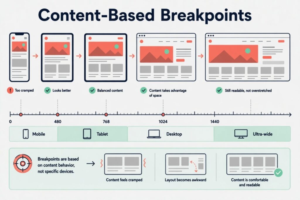
2. Media Queries and Breakpoints
Media queries are the backbone of responsiveness. Define breakpoints (e.g., 480px for mobiles, 768px for tablets, 1024px for desktops) to adjust styles as the viewport changes. A mobile-first approach starts with base styles for small screens and layers on enhancements with min-width queries.
3. Responsive Images and Media
Implement srcset and the element to serve appropriately sized images. Lazy loading (loading=”lazy”) prevents unnecessary downloads. For videos and other media, ensure they resize fluidly with max-width: 100%; height: auto;.
4. Viewport Meta Tag and Touch Optimization
Always include in your HTML head. Design touch-friendly interfaces with adequately sized buttons (at least 48px), generous spacing, and intuitive gestures.

5. Performance Optimization
Mobile users often browse on slower connections. Minimize HTTP requests, compress assets, and leverage browser caching. Techniques like Critical CSS and code splitting keep initial load times lightning-fast. Test with tools like Google PageSpeed Insights or Lighthouse for real-world metrics.

6. Testing and Iteration
Real-device testing beats emulators. Use BrowserStack or physical devices alongside Chrome DevTools’ responsive mode. Monitor analytics to identify drop-off points and refine accordingly.

Current Trends in Responsive Design
We’re seeing a rise in component-based architectures (think Tailwind CSS or utility-first frameworks) that accelerate responsive development. Dark mode support, variable fonts, and 3D/immersive elements that adapt gracefully are also gaining traction. Accessibility remains non-negotiable—ensure ARIA labels, sufficient contrast, and keyboard navigation for inclusive experiences.
At Teamwork Lab, we stay ahead of these trends by blending creativity with technical precision, creating websites that not only look stunning but perform exceptionally across every device.
Ready to take your brand to the next level?
Optimizing your website for every screen is one of the smartest investments you can make. Whether you need a full redesign, mobile-first rebuild, or performance audit, our team is here to craft solutions tailored to your goals.
Let’s work together to craft your success story. Check out our free assessment today and discover how our cutting-edge web solutions can elevate your digital presence. Your perfect website is just a conversation away!
Teamwork Lab – Building stronger digital foundations for ambitious brands.
Love this? Share on your social media and
let’s spread the success together!
Related Services

WEB DESIGN
From vision to blueprint, we craft stunning, user-friendly websites that reflect your brand and set the stage for success.

WEB DEVELOPMENT
We turn designs into reality with fast, responsive, and seo-friendly websites—built to perform and ready to impress.

WEB CONTENT CREATION
Engaging words, visuals, and stories that captivate your audience and make your brand unforgettable.
Free Downloads

Free Website Audit Checklist
Evaluate your current site and uncover quick wins

Brand Story Worksheets
Rank higher on Google or in any search engine

Website Launch Checklist
25 essential steps to launch a high-converting website